Have you ever landed on a website using your phone and had to pinch, zoom, and scroll endlessly just to read a single sentence? It’s frustrating. That frustrating moment is a poor user experience, and it often leads to one action: hitting the back button. In a world dominated by mobile devices, ensuring your website offers a smooth journey for every visitor isn’t just a nice-to-have; it’s a necessity for survival.
This is where responsive web design comes into play. It’s the art and science of creating a single website that adapts beautifully to any device, from a wide desktop monitor to a compact smartphone screen. Investing in professional responsive web design services is one of the most impactful decisions you can make for your digital presence. It directly shapes how users perceive and interact with your brand online, influencing everything from engagement to your bottom line.
This article will explore how a responsive approach is the cornerstone of a positive user experience. We will cover how it boosts your SEO, increases conversions, and builds a stronger online presence for your business.
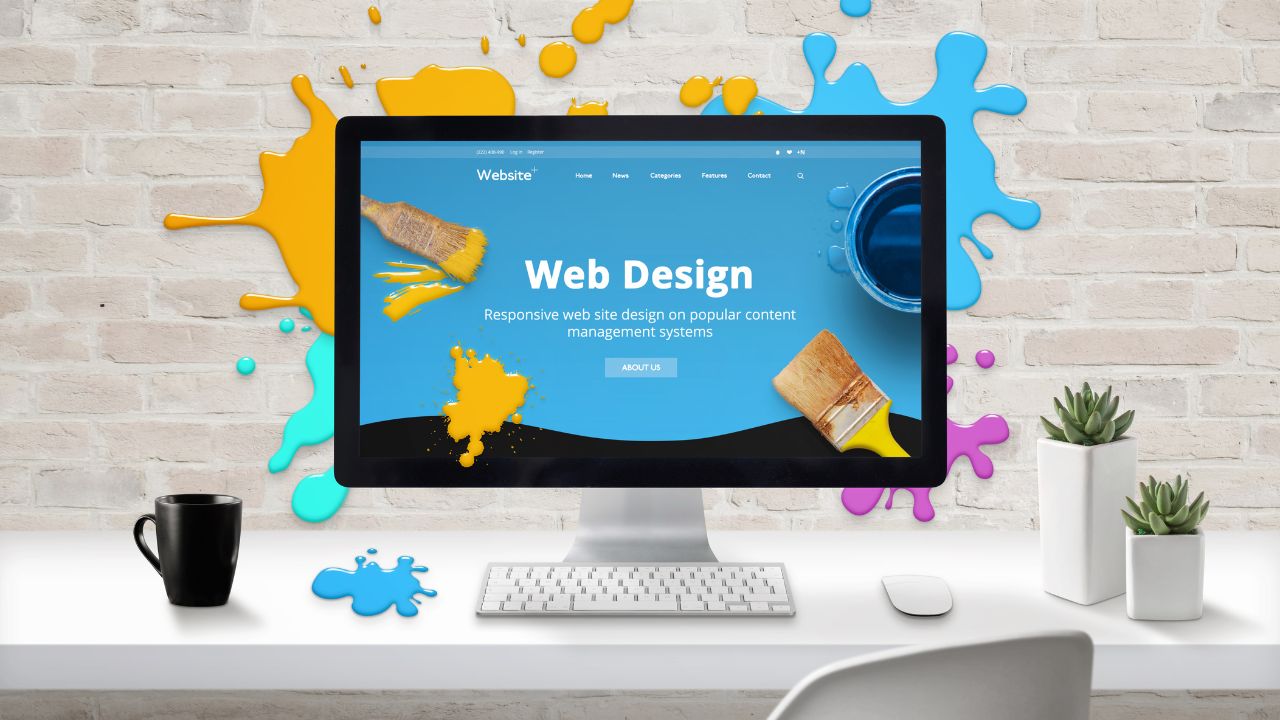
What is Responsive Web Design?
Before we dive deeper, let’s clarify what responsive web design actually is. Responsive web design services focus on creating websites that automatically adjust their layout based on the size and orientation of the screen they are viewed on. Instead of building separate sites for desktops and mobile devices, these services provide a single, flexible website that delivers an optimal experience for every user.
Think of it like water, which flows and fits perfectly into any container. Similarly, a website designed through responsive web design services adapts its content, navigation, and images to fit all screen sizes. This flexibility is essential for a seamless user experience, and professional web design companies specialize in crafting these intelligent, user-friendly frameworks.
The Direct Link Between Responsiveness and User Experience
User experience (UX) refers to the overall feeling a person has when interacting with your website. Is it easy? Is it pleasant? Can they find what they need without friction? Responsive web design services are fundamental to achieving a positive UX because they address the primary ways people access the internet today.
A site that isn’t optimized for mobile forces users to work too hard. Text is tiny, buttons are impossible to tap, and images are cut off. This creates friction and annoyance, which are poison to good user experiences. A responsive site eliminates these issues, making interactions intuitive and effortless, regardless of the device.
Key Ways Responsive Design Enhances the User Journey
Hiring a web design agency to implement responsive design isn’t just about following design trends. It’s a strategic investment that delivers tangible benefits for your users and your business.
1. Delivers a Seamless Experience on All Devices
The modern customer journey is rarely straightforward. A user may first find your brand on a laptop at work, explore your products on a tablet in the evening, and complete a purchase on their smartphone during their commute. Responsive web design services ensure this experience remains seamless and consistent across all devices.
By maintaining a familiar look and intuitive navigation on every screen, you build trust and reduce cognitive effort. Users don’t need to relearn your site or hunt for information, creating a smooth, user-friendly environment that encourages exploration and repeat visits.
2. Boosts SEO and Search Engine Rankings
Search engines like Google prioritize delivering the best results to their users. Since a huge percentage of searches happen on mobile, Google gives preference to websites that work well on these devices. In fact, mobile-friendliness has been a significant ranking factor for years.
Here’s how responsive web design services contribute to better SEO:
- Single URL: A responsive site uses one URL for all devices. This consolidates your SEO efforts, making it easier for a search engine to crawl, index, and rank your content. It also prevents issues with duplicate content.
- Lower Bounce Rates: When users on mobile devices land on a site that’s difficult to use, they leave immediately. This high bounce rate signals to search engines that your site isn’t valuable. A responsive site keeps users engaged, lowering bounce rates and improving your authority.
- Increased Dwell Time: A seamless user experience encourages visitors to stay longer. They can easily read your blog, browse your products, and engage with your content. Longer dwell times are a positive signal to search engines.
Ultimately, a strong digital marketing strategy is incomplete without a solid, responsive foundation.
3. Increases Conversion Rates
A happy user is more likely to become a customer. The goal of any commercial website is to guide visitors toward a specific action, whether it’s making a purchase, filling out a form, or signing up for a newsletter. This is measured by your conversion rate.
A clunky mobile experience creates barriers to conversion. If a user can’t easily click the “Buy Now” button or fill out your contact form, you’ve likely lost a sale. Responsive web design removes these obstacles by:
- Optimizing forms for smaller screens.
- Ensuring buttons are large and easy to tap.
- Simplifying the checkout process for mobile users.
By ensuring your website is effortless to use, you directly pave the way for higher conversion rates. This turns more visitors into leads and customers, maximizing the return on your web design services investment.
4. Builds Brand Trust and Credibility
Your website is often the first interaction a potential customer has with your brand. A professional, modern, and easy-to-use site communicates that you are a credible and trustworthy business. An outdated or broken mobile site suggests the opposite. It can make you seem unprofessional or out of touch.
Investing in mobile-friendly designs shows that you care about your audience and their experience. This attention to detail reflects positively on your entire brand. A professional web design agency can provide tailored solutions that not only look great but also align with your brand identity, further strengthening your online presence.
What Is the Main Benefit of Responsive Web Design for Users?
The main benefit of responsive web design for users is convenience. It provides an optimal and consistent viewing experience across all devices, from desktops to smartphones, without requiring them to pinch, zoom, or scroll horizontally. This makes websites easier to navigate and read, leading to a frictionless and more enjoyable user experience.
The Future is Responsive
The digital landscape is always evolving, but the importance of the user is constant. As new devices with different screen sizes emerge, the principles of responsive web design will only become more critical. It’s no longer just a trend; it’s the standard for effective website development.
Ignoring the need for a responsive site means you are actively excluding a large portion of your potential audience. It undermines your digital marketing efforts and puts you at a significant disadvantage against competitors who prioritize their user experiences.
Choosing the right partner is key. A skilled web design company won’t just build you a website. They will analyze your business goals and audience to create tailored solutions that deliver a superior user experience and drive real results. From initial design to final development, their expertise in creating mobile-friendly designs is invaluable.
In conclusion, responsive web design services are not just a technical upgrade; they are a fundamental component of a customer-centric business strategy. By focusing on providing a seamless user experience for every visitor, you boost engagement, improve your search engine rankings, increase your conversion rate, and build a stronger, more credible brand.
Ready to transform your website into a powerful tool that delights users on every device? The team at MacroHype specializes in crafting custom responsive web solutions that drive growth. Contact us today for a consultation, and let’s build an exceptional online experience together.

